- First Impressions Matter: the Welcome Mat 🏠
- Intuitive Navigation: Your Gps through Design 🧭
- Speed Thrills: the Need for Fast Responses ⚡
- Clarity in Communication: Icons and Labels Speak 🗣
- Accessibility: Design for All Users 👫
- Feedback Loops: Conversations with Your Creation 💬
Table of Contents
ToggleFirst Impressions Matter: the Welcome Mat 🏠
Imagine you’re stepping into a friend’s house for the first time. What catches your attention? Is it welcoming and easy to find your way around, or does it feel like a maze? In the world of websites and apps, this first encounter is just as crucial. The moment a user lands on your page, they’re greeted by what could be thought of as a virtual welcome mat. It’s not just about looking good, but also about feeling right. A cheerful color scheme, a clean layout, and an inviting message are like a friendly smile and a warm handshake; they set the tone and say, “Come on in, you’re going to like it here!”
But it’s more than just first looks. Imagine a welcome mat that somehow showed you where to hang your coat and offered you a drink. That’s what a well-designed homepage does. It doesn’t just greet visitors; it guides them. With a glance, they know where to click for information, how to start shopping, or where to sign up. The key is a balance between beauty and brains 🧠, style and substance ✨. Paring down the clutter and opting for simplicity ensures that the welcome mat is not just clean, but clearly points to the door.
| Aspect | Role in First Impressions |
|---|---|
| Color Scheme | Sets the emotional tone |
| Layout | Guides the eye and suggests order |
| Inviting Message | Welcomes and instructs the user |
| Simplicity | Ensures a clear path forward |
Intuitive Navigation: Your Gps through Design 🧭
Imagine walking into a building for the first time and finding your way around without even thinking about it – that’s what a well-designed interface feels like. It’s like having a trustworthy guide leading you, ensuring that everything you’re after is right where you’d expect it to be. As users journey through an app or website, clear pathways and signposts direct them effortlessly to their destination. Handy tools are within reach, just when they’re needed, making the experience not just user-friendly, but user-delightful.
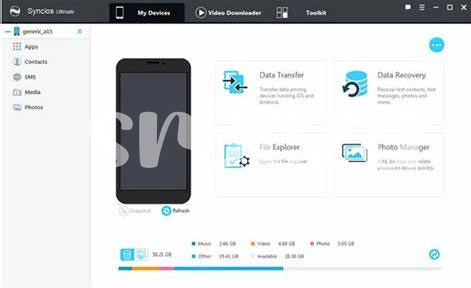
Consistent and logical placement of elements lets users move with confidence, almost as if they’ve been there before. Think about when you pick up your phone to find the best tool for a task, like keeping your digital life in order—where do you turn? For those looking to safeguard their Android device data, finding a top-notch backup app is crucial. In this world of countless options, one might wonder, what is the best Android in 2024 updated backup app? By providing clear and familiar visual cues, users are not left second-guessing their choices but can confidently make informed decisions swiftly and move on with their day, feeling satisfied and accomplished.
Speed Thrills: the Need for Fast Responses ⚡
Imagine you’re in a fast-food restaurant, hungry and eager to order. You step up to the self-service kiosk, and with a few quick taps, your meal is on its way. It’s satisfying, isn’t it? That’s because we love when things work quickly and smoothly. The same goes for using a website or an app. When you click a button or swipe on a screen, you expect instant results, like magic. 🎩⚡ A snappy reaction keeps you hooked and happy because, let’s face it, nobody likes to wait.
Now, think about spinning wheels or loading bars; they’re like traffic jams in our digital journey. These delays can test our patience and sometimes even make us give up and look elsewhere. That’s why fast-loading pages and swift feedback from our actions are so essential. They not only keep us engaged but also signal that the site is well-oiled and trustworthy. A zip here and a zoom there, and we’re flying through online tasks with the ease of a bird in the sky. And when accessibility tools join this rapid response team, it’s like giving turbo-boosted wings to all users, ensuring everyone is part of this seamless glide. ✈️👍 Fast responses truly make our digital experiences soar.
Clarity in Communication: Icons and Labels Speak 🗣
Imagine you’re in a new city, looking at street signs to find your way. Much like those signs, in the digital landscape, icons and labels are the silent guides that help users navigate through an app or a website. They’re the symbols and short words that tell you ‘click here,’ ‘this means home,’ or ‘here’s the search function.’ Just as street signs use simple imagery for quick understanding, good icons and labels should be instantly recognizable, making your time spent on an app or website feel like a stroll in a properly marked park rather than a trek through an uncharted jungle. 🌐👁
Not only do they show the way, but they also speak the language of the user, transcending the barriers of text and literacy. Good icons don’t need translation; a shopping cart is universally understood to lead you to your purchases, and an envelope icon implies a section for messages or contact information. Labels, on the other hand, buttress this visual shorthand, ensuring that there is no ambiguity about the purpose of an icon. They are like a friendly local who points you in the right direction with a simple gesture and a clear word.
In the same vein, the digital world constantly evolves, and so do our tools. For instance, if you’re choosing the latest tech to keep your personal data secure and accessible, you might ask “what is the best android in 2024 updated backup app” to ensure your digital life is as orderly as your interfaces. Icons and labels are tireless little helpers that matter more than we often appreciate, working behind the scenes to ensure our online experience is smooth, seamless, and pleasant. Without them, we’d surely be lost. 🗺️✨
Accessibility: Design for All Users 👫
Imagine stepping into a world where everyone, regardless of their abilities, can engage effortlessly with the space around them. 🌐 In the realm of interface design, this inclusivity is not just a nice-to-have; it’s essential. Paving the way for this journey, smart design choices ensure that whether one has limited vision, difficulty with fine motor skills, or faces other challenges, the digital landscape remains accessible. Simple tweaks, like adding text descriptions to images (also known as alt text) or ensuring that buttons are large enough to click without a hitch, make a significant difference. It’s about embracing the diversity of human experience and reflecting this in the tools we create.
To put this into perspective, here’s a snapshot of features that lead the charge in making digital spaces open for all:
| Feature | Description |
|———|————-|
| High Contrast Modes | Ensures text stands out against the background, aiding those with visual impairments. |
| Text-to-Speech | Allows content to be read aloud, helping users with visual difficulties or reading disorders. |
| Keyboard Navigation | Enables users to navigate without a mouse, crucial for those with motor skill challenges |
| Adjustable Text Size | Users can enlarge text to suit their visual comfort, making reading easier for everyone. |
By weaving these elements seamlessly into the design fabric, the end result is a digital tapestry that is both functional and welcoming—a place where the conversation is louder, not with noise, but with the voices of everyone. Building bridges across the digital divide, such thoughtful design ensures that every user’s voice can be heard and their presence felt. It’s a celebration of difference, a rallying cry for inclusivity, and a testament to the fact that good design genuinely is for everyone. 👐
Feedback Loops: Conversations with Your Creation 💬
Imagine chatting with a friend; that’s the heart of a great interface. It’s not just about looking good; it’s about actually talking back, like a good buddy who gives you a nudge in the right direction when you’re lost. When you tap, swipe, or click, the screen lights up with a reaction, maybe a little buzz, a sound, or a friendly pop-up—that’s your digital pal letting you know you’ve been heard. 🗨 This back-and-forth chatter is the secret sauce that makes your journey through websites and apps feel more human, more connected. It’s not just cold code; it’s warm, encouraging feedback that guides you. Like when you fill out a form and get a high-five in the form of a “Well done!” message or a gentle oops when something’s not right. 🔔 Those are the moments where design transcends pixels and becomes a conversation. And when the design is truly inclusive, it means everyone joins the chat, regardless of their abilities, which is like adding vibrant new voices to a growing chorus. It’s powerful stuff, because when you know your interface is ready to respond to every interaction, every user’s experience is not just acknowledged—it’s celebrated. 🎉 This interactive gabfest doesn’t have to shout; it’s the subtle art of being present, listening, and evolving based on what users share, keeping that digital dialogue flowing and your interface feeling like the friendliest face in the tech crowd.


